


Responses by Harry Pearce, partner, Pentagram.
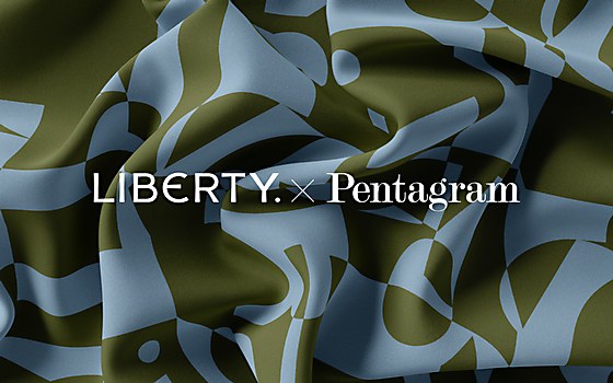
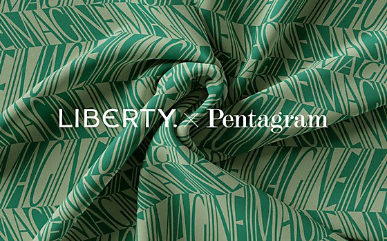
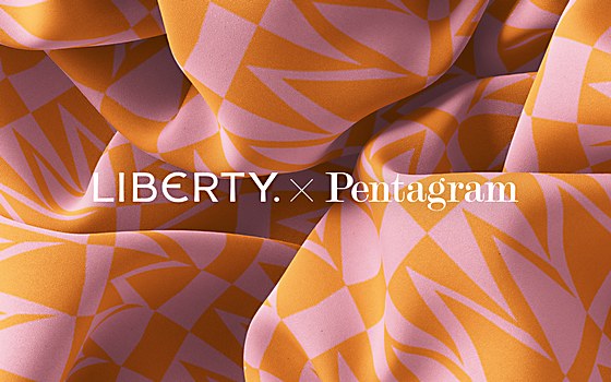
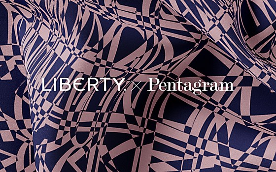
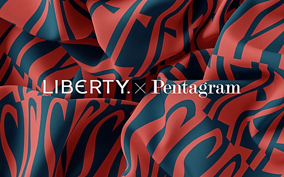
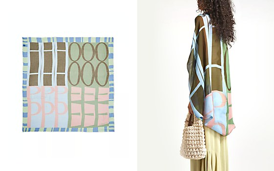
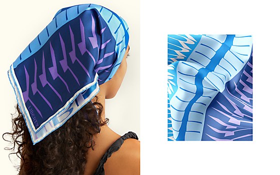
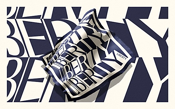
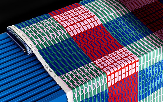
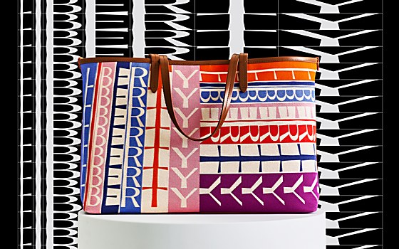
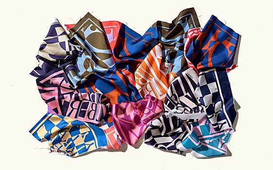
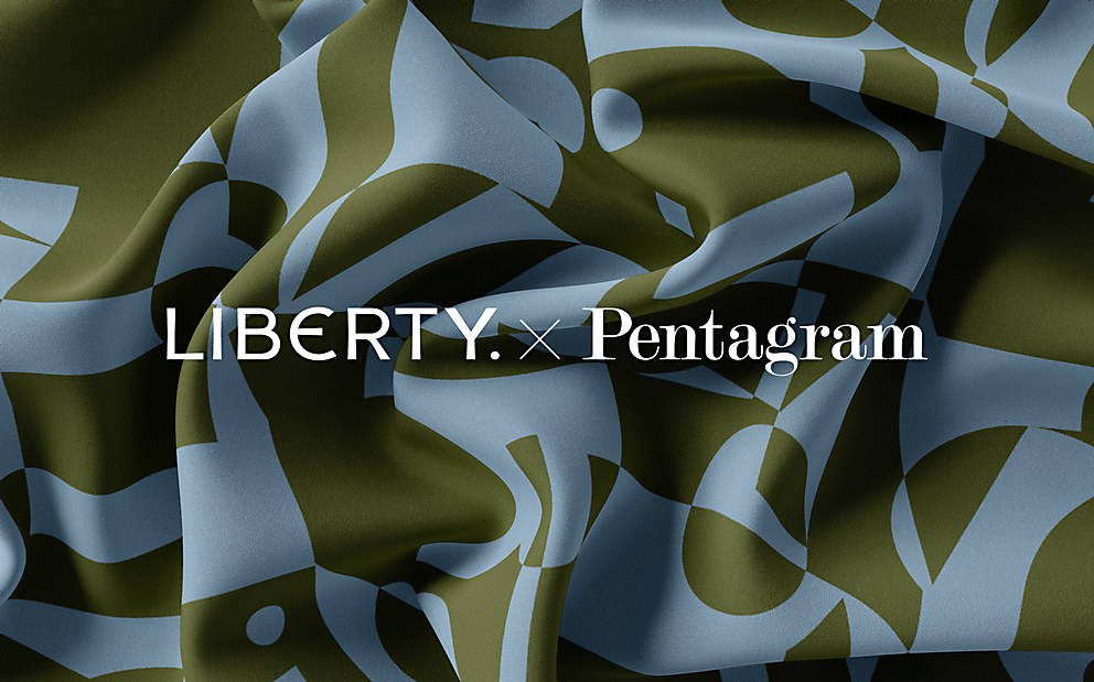
Background: Textile company Liberty has been creating fabrics for almost 150 years, the William Morris patterns being some of its most iconic. The purpose of this project was to create a new fabric collection born from the visual language of the Liberty brand itself—a range that could expand and expand over the coming years, appealing to the heartland of the Liberty customer.
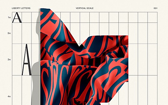
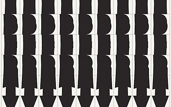
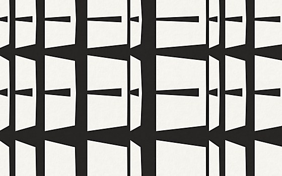
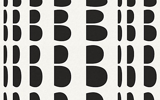
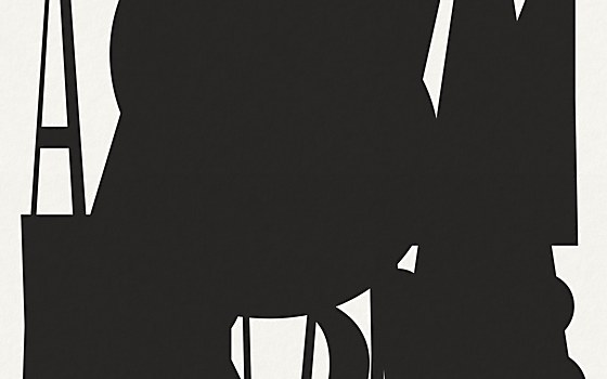
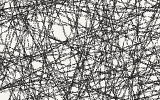
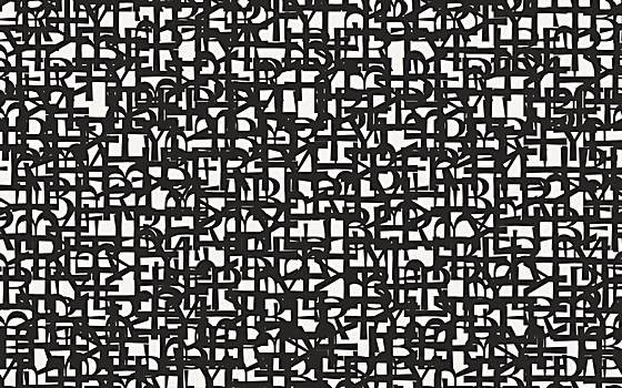
Design thinking: We had created the new brand identity for Liberty a few years ago. Included in this was the bespoke typeface Lasenby Sans, named after Liberty’s founder Arthur Lasenby Liberty. From this inception of the new identity, we took an attitude toward typography we call “Soft Dada,” which was full of idiosyncratic fun. This philosophy gave us the inspiration to create these fabric patterns from the typography itself. We thought it would be a pure moment of self-expression for the brand and usher in a new era of experimental fabric design for Liberty.
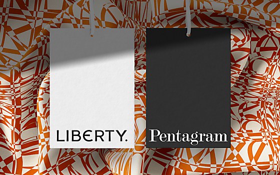
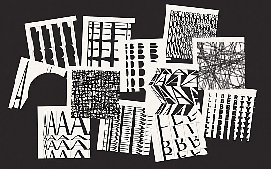
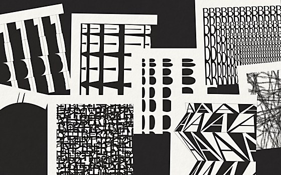
Challenges: Being able to imagine how our designs would make sense as fabrics. We are essentially graphic designers, and this was uncharted waters for us. However, the Liberty team gave us free rein and encouraged us to be experimental. This gave us confidence, knowing our work would be adapted correctly. What is so pleasing is that the designs barely changed at all between our original vision and the final fabrics.
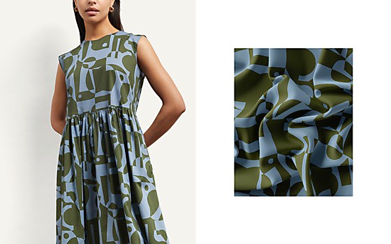
Favorite details: We are so proud that we have developed an identity for Liberty that can be used as a pure form of self-expression and that can be developed as a product in its own right. A form that can be reimagined over and over again, allowing Liberty years of invention. The hope is that this will be defining for it as so many patterns have been in the past, signifying a bold new design confidence.
Visual influences: Experimental “Dada” typography was undoubtedly a key influence in our work, more as an attitude and approach to language and form. We found our own aesthetic with the liberated approach that was so groundbreaking in the days of Dada.
New lessons: A really important piece of creative learning came from the process. We were allowed a very generous amount of time to experiment with our typography. This meant we were able to push forward a long way from our initial thoughts and ideas. We became braver and more confident as time passed. We were entrusted with great freedom to work as we wished. It’s this that I wish to take forward in future work, encouraging clients to allow us that.
Browse Projects