


Responses by Martina Meier, type designer, Nouvelle Noire.
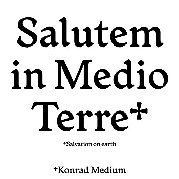
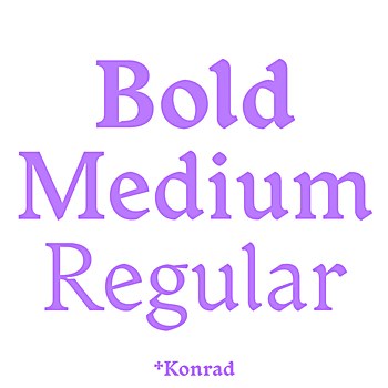
Background: My aim was to create a contemporary typeface that transports the spirit of the proto-roman era into the present day. Konrad is meant to be used in projects where type does not only play a neutral role. It is a tool for designers who want to create something outstanding with a typeface that has unique characteristics shaped by history.
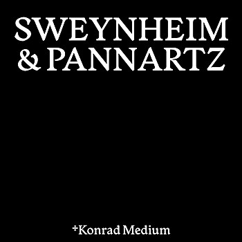
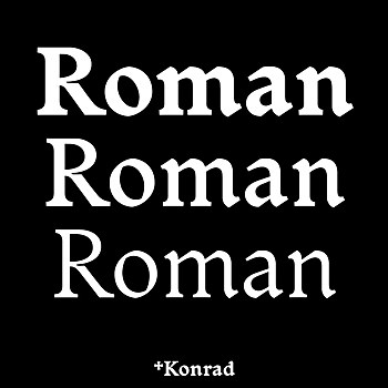
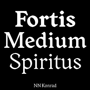
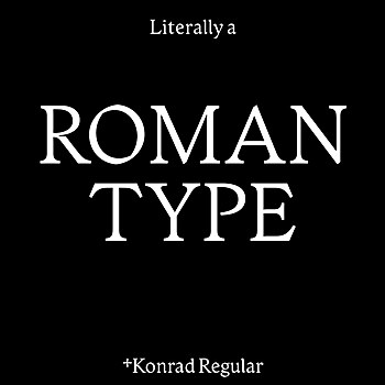
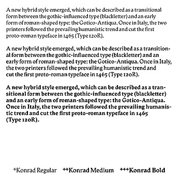
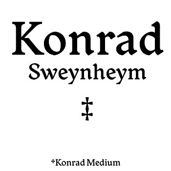
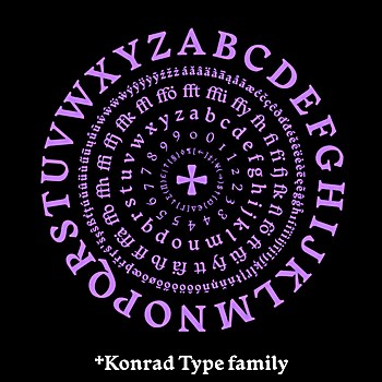
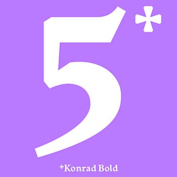
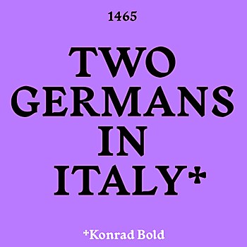
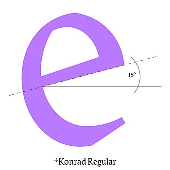
Design thinking: Konrad is my contemporary take on the first roman typeface printed in 1465 by German designers Konrad Sweynheym and Arnold Pannartz in Italy. This proto-roman typeface was the inspiration and starting point for the creation of Konrad. The final type family stands out because of its unique combination of archetypal elements from gothic scripts with the appearance of a contemporary serif typeface.
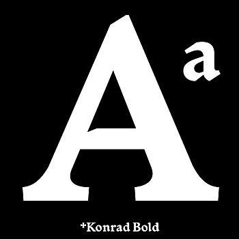
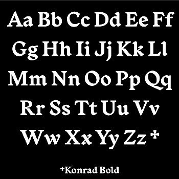
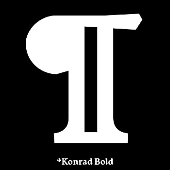
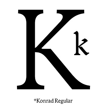
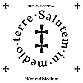
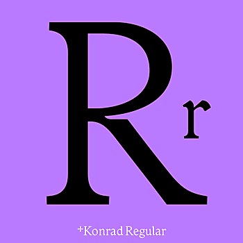
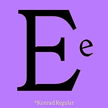
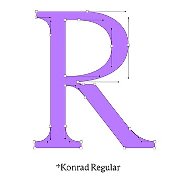
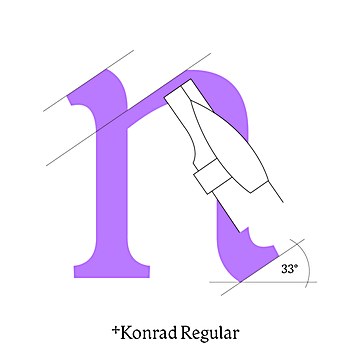
Favorite details: The curved ending at the n is very characteristic and also occurs correspondingly at the m and h. In addition, the plateau at R and K is a significant detail of the font.
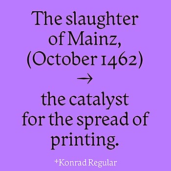
New lessons: Since I had never made a typeface before, everything was new to me. Borrowing from a historical typeface pattern was an exciting starting point that I can recommend. The more I dove into the history of Sweynheym and Pannartz, the more exciting it became. I learned a lot about type history as I developed the typeface: What impact did the printed word have on society? How and why did printing spread, and subsequently, how did writing styles change?
Time constraints: Fortunately, I had no time constraints. Since I got a lot of attention to the writing from the beginning, at some point, the desire to publish the writing strengthened.
Alternate paths: If I had to do it all over again, I would not start with the medium style. At the beginning, I didn’t know that I would develop the typeface into a type family. I was oriented toward the historical type stencil, and these prints were rather “bold.” During the development of the type family, I had to draw Regular and Bold from it, and the Medium weight became obsolete due to the interpolation of the masters.
Browse Projects