


Responses by Kevin Cantrell.
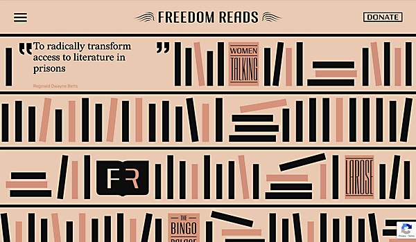
Background: Freedom Reads, a first-of-its-kind organization, uses literature to empower people to confront what prison does to the spirit. Literature nourishes us all, whether in or outside of prison, with its ability to transport us, view the world through another’s eyes, feel a wealth of human emotions and ultimately envision new possibilities for our own lives. Freedom Reads transforms the lives of people in prison one carefully curated library at a time. Its mission is to place millions of books into prisons by opening a 500-book microlibrary in every prison housing unit in the United States.
To accomplish this, the nonprofit required a website that communicates to and engages financial resources and departments of correction. The site needed to clearly outline Freedom Reads’s vision, initiatives and benefits to foundation and grant providers—like the Mellon Foundation—and individual private donors, while also educating prison officials considering integrating a Freedom Library into its facility. The website required clean on-ramps and funnels to drive donations and library installs at incarceration facilities.
In addition to operational considerations, the website would be Freedom Reads’s first expression of its new branding, which Satellite also designed. As such, the website and elevated identity signal the nonprofit’s entrance onto the national philanthropy stage as a meritorious organization delivering an outsized agenda of bringing transformative literature to every prison housing block in the United States.
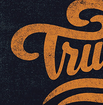
Design core: The Freedom Reads website became a core showcase for its new brand system. Core identity elements include a book with a Spencerian wings logo, a proprietary typeface called Freedom Library Bookshelf and a brand graphical system that turns bars into books. The modular bookshelf type and iconography expressed throughout the website suggest the power of literature to provide sustenance to the mind and spirit. Through the website’s design and UI, we sought to embody the organization’s belief that dignity and freedom begin with a book.
Favorite details: The monogram animating into shelves that demonstrates the transformative qualities of books.
Challenges: The site was designed to be responsive, of course, and work seamlessly across device sizes. However, we wanted the browser experience to be wonderfully grand, like reading a full-page newspaper double spread. It took a while to pull off the responsive transition states, but we did it. If you’ve got a large monitor, blow it up—it’s epic.
Alternate paths: If I were to start the design over again, I would like to bring to life the experience of browsing the great books in the Freedom Library collection, which reads like a who’s who of humanity’s greatest literature. Through interactive book motifs, we would invite donors to talk about the books that have opened their own worlds. When we remember how books have transformed our own lives, I believe this generates an empathic immediacy to the criticality of making sure all people on the inside and out have access to literature—and gets donors to click Donate and make it so! Perhaps as we evolve the site over the next phase of our relationship with Freedom Reads, we’ll be able to expand the digital experiences available.
Navigation structure: The idea behind the overall flow was trying to make it feel like the user is scrolling through items on bookshelves.
Browse Projects