
Responses by ET Studio.
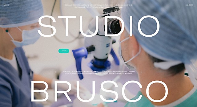
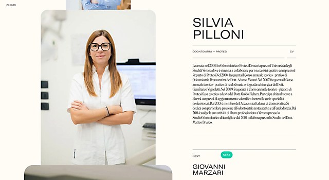
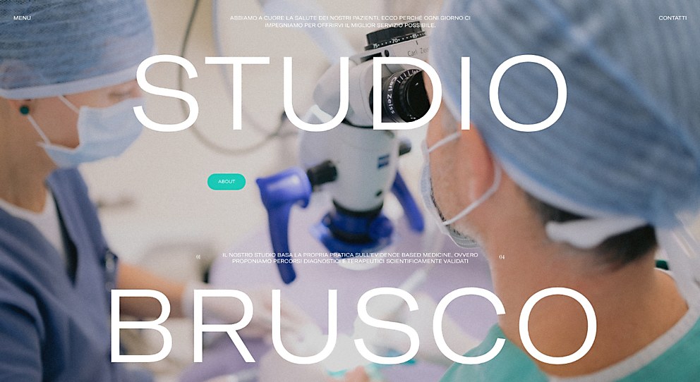
Background: The website for Studio Brusco, a complete service dental studio in Verona, Italy, introduces it to the public differently when compared to all other entities in the same sector. The key to achieving this was to narrate every aspect of the studio through videos with the people as the protagonists. When branding a medical environment, the human element is fundamental to show users closeness and empathy. What better medium than video to effectively and directly reach users?
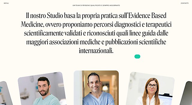
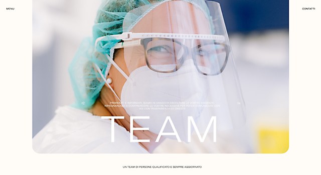
Design core: The video content serves as the main element that characterizes the entire experience. These clips accompany the user as they navigate the website, from the homepage to the individual service pages to even the menu. The people of Studio Brusco take the spotlight in these videos, as it is through them that every element of the dental practice is humanized.
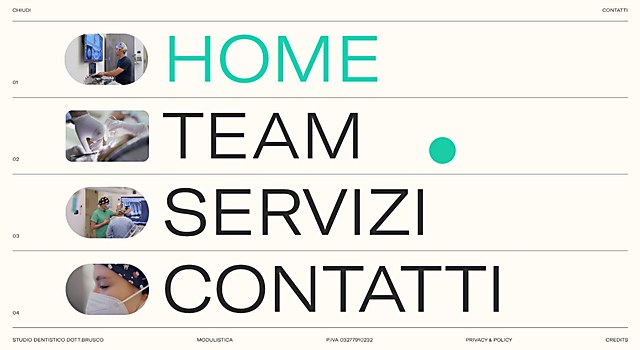
To create coherence and continuity in the navigation experience, we sought to link each section and page of the website through videos. A concrete example of this is visible in the menu; for each item, the videos already present on the homepage appear in a rollover.
Another crucial and evident feature of the entire project is the choice of readable and clear fonts for everyone. Given the broad target audience, we needed to facilitate accessibility even from a typographic perspective. This aspect is part of a broader context when it comes to the colors used: the contrast between white and black against the mouse pointer, which is the sole colored graphic element. Besides reflecting one of the classic colors of the medical palette, the mouse pointer becomes a feature that facilitates navigation.
Challenges: Precisely in the use of video. The major challenge, first and foremost, was to make the client understand the potential of using video as a communication medium in a sector that generally doesn’t make extensive use of it. After that, the second step was to condense everything that each section had to convey into a few seconds.
New lessons: We cannot say we learned something entirely new, but rather, we confirmed the fact that the quality of the content we chose to use has a significant impact—one that cannot be underestimated. The material’s quality is indeed the starting point to create an aesthetically pleasing, functional experience. Therefore, it is essential to pay particular attention during the content production phase.
Navigation: What we particularly focused on in addition to designing a user-friendly navigation system was the correlation and continuity between pages. We ensured there were no evident, tedious loading times for users. Everything became fluid and seamless when moving from one page or service to another, with minimal shifts and excessive clicks.
Technology: We built the website using Nuxt and rendered it via server-side rendering. We utilized Strapi as the CMS, which let us manage image compression and conversion to webp formats. The site features numerous complex interactions, such as the homepage slider, seamless video transitions between pages, a team carousel and corresponding detail pages. To bring our ideas to life, we utilized GSAP along with plugins like Draggable, FLIP and Observer.
Browse Projects