Responses by Allison Connell, design director, Athletics.
Background: The Nation is a magazine founded by abolitionists in 1865 and provides a home for independent journalism. It publishes commentary and debate for progressive, politically minded readers.
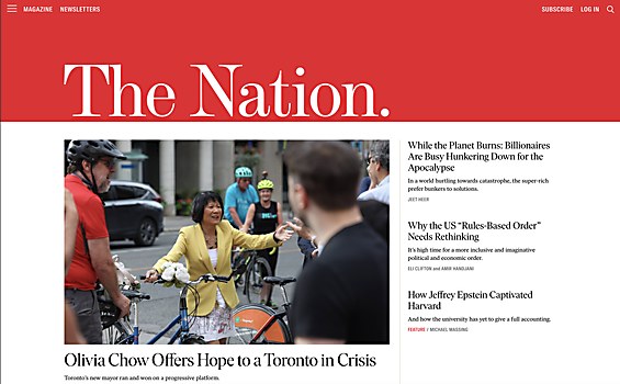
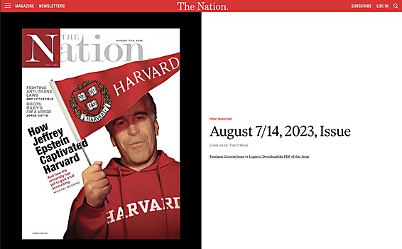
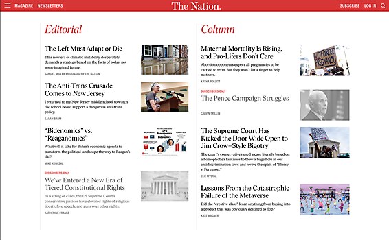
Design core: One goal of the redesign was to lean into The Nation’s heritage and rich history to help present it as a long-established voice. We enjoyed digging through the archives to look at historical illustrations and type details, like the use of italics, as well as The Nation’s magazine covers from the more recent past, such as those designed by Milton Glaser and designer Scott Stowell of Open. We ended up coming back to some core things: a big red masthead for the lgo and its core red color, which we extended into some pink tints to differentiate some of the call-to-action moments from the content.
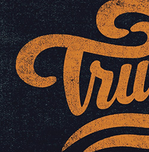
Favorite details: We were excited to get to work with Tré Seals of Vocal Type on an update to the logo. The final result was based on a combination of the original logo from 1865 and another similar version from more recent times; we adjusted these to have a cut that works well in the digital age and at smaller scales.
Challenges: The goal was to do a visual refresh of The Nation’s site, not a full rebrand. It was difficult considering the magazine doesn’t have existing brand guidelines or a cohesive extensive brand system already in place. So, we were working in a design system that was somewhat undefined. This was one reason we went back to The Nation’s archives to take inspiration from past details and past covers.
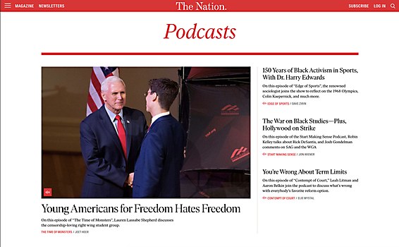
Navigation structure: The core focus for the navigation is to call attention to things we want the user to do or know, rather than the type of content The Nation produces. The thinking here was that people are not likely to use the navigation to discover content as much; they’re more likely to be coming in via an article shared from another source. So, it was better to use the navigation to talk to the fact that there’s an associated print magazine, podcasts and newsletters, or to promote donation.
Special technical features: We spent some extra attention working with the Gutenberg block system to give the editors more control over the placement of auxiliary items in the article body—ads, calls to action and related links, among other items—while also reducing manual labor. The editors go through their normal workflow of editing the article and inserting images. Then, upon save of the article, the auxiliary items are dynamically placed throughout. The block system enables The Nation’s editors to manipulate and adjust the placement to better suit the content. It also helps generate more ad impressions because it allows The Nation to place more ads on longer pieces or remove them entirely on sensitive content types, like an article remembering someone who has passed away.


